Web design is a crucial aspect of the digital world and has been rapidly evolving in the last few years. With the increasing use of different devices for accessing the web, it has become necessary for websites to be accessible and functional on different screens, from desktops and smartphones to IoT devices. In fact, it has become a norm rather than an exception.
However, many people have trouble distinguishing between two dominant approaches to web design: pixel-perfect and responsive. While they do share some basic similarities, the two types are inherently different and cater to different end goals. This is especially important for businesses looking to create their own websites.
In this article, we will discuss the two approaches in order to explain how both types contribute to satisfactory solutions. In addition, we will touch on terms that often get confused with responsive design — fluid and adaptive web design.
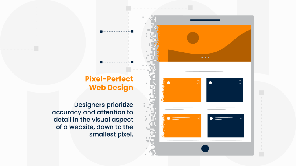
Pixel-Perfect Web Design
Pixel-perfect web design is a design approach that prioritizes accuracy and attention to detail in the visual aspect of a website. In this approach, designers aim to achieve an exact representation of a design concept, down to the smallest pixel. This requires a high level of precision in the placement and size of elements on a web page, as well as careful consideration of typography, color, and other design elements. The ultimate goal of pixel-perfect design is to create a website that looks exactly as intended, regardless of the device it is viewed on.
However, for this design to be possible and, in a sense, “perfect,” one must keep in mind that multiple versions need to be created to incorporate the design for every device. Creating multiple versions can be time-consuming and costly.
Furthermore, while the pixel-perfect design allows for the layout of the website to be precisely controlled and offers a great user experience for desktop users, it directly translates to a poor reading experience on mobile screens. And considering the popularity of smaller screens, websites need to look great and perform quickly on all devices and screen size combinations. In such circumstances, pixel perfection may not be an achievable solution.
Responsive Web Design
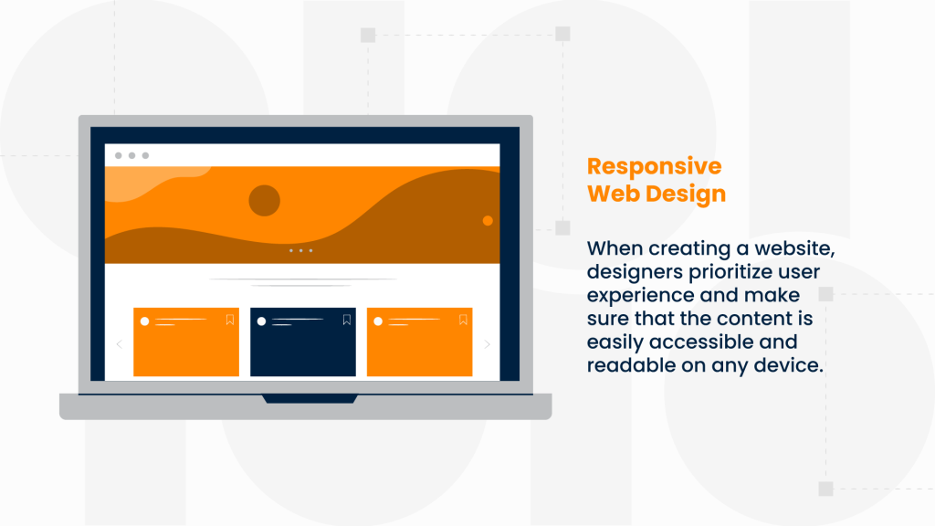
Responsive web design (RWD), on the other hand, is a design approach that focuses on creating websites that adjust to the size and orientation of the device they are being viewed on. It prioritizes the user experience and makes sure that the content is easily accessible and readable on any device.
To create a seamless user experience across all devices, responsive web design uses media queries to target breakpoints which allows for flexible layouts, images, and typography. The goal is to ensure that the website looks good and functions optimally, no matter the size of the screen. And to achieve this, developers need to create only one code-base.
Following digital trends, it is interesting to note that responsive design is recommended and rewarded by Google. In order to welcome the growing number of mobile users, Google has to constantly update its algorithm. To that end, they take into consideration how mobile-friendly a website truly is when determining search engine rankings. As a result, websites which don’t utilize responsive web design, may find themselves at the very bottom of the search engine. An outcome that growing businesses find less than ideal.
What Is the Difference?
Despite their differences, pixel-perfect and responsive web design share some similarities. Both approaches aim to create high-quality websites that look good and function well. However, they differ in their approach to design and prioritization of elements. As mentioned, the pixel-perfect design prioritizes precision and accuracy, while responsive design favors flexibility and adaptability across all devices.
Both types have their strengths and weaknesses, and the right approach for a particular project depends on the client’s specific requirements and goals. One must also consider the target audience and predict which devices will be predominantly used and decide accordingly.
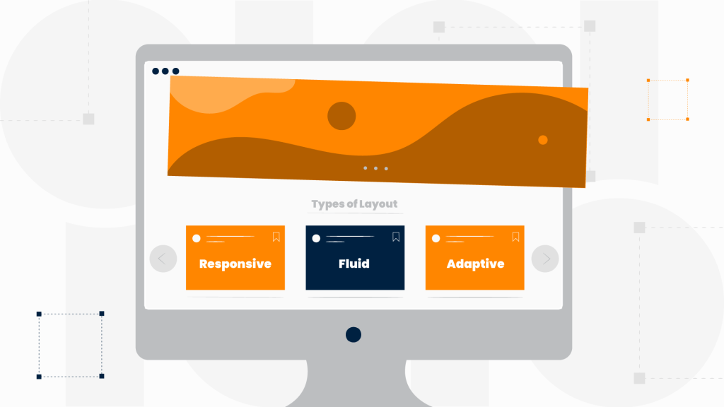
Terminology Explained: Fluid and Adaptive Web Design
When talking about responsive web design and its characteristics, two other approaches emerge — fluid and adaptive web design. Although both share some similarities to responsive web design, they each have their distinct elements and benefit different situations.
Fluid Web Design
Fluid Web Design (FWD) is a similar approach to responsive web design. In this method, instead of using fixed widths, fluid web design uses percentages to determine the width of elements on a web page. This allows for the web page to adjust seamlessly to different screen sizes, similar to RWD.
However, while fluid design can make the experience more organic as the user transitions from one device to another, it can also create problems. Namely, there is the issue of the size of the browser. For example, smaller screens can experience crowding of the content and bigger ones can have a seemingly stretched-out layout.
To make a web design fluid, developers should know how to incorporate it within the code. Additionally, some would argue that while every responsive design is also fluid, not every fluid design is responsive.
Adaptive Web Design
Adaptive Web Design (AWD) is a different approach compared to responsive and fluid web designs. In AWD, the design of the website is created specifically for different screen sizes and resolutions. The website changes its layout depending on the device used to access it. Unlike RWD and FWD, adaptive web design does not use flexible layouts; instead, it uses different sets of CSS styles for different devices. This results in a more tailored user experience, but it also requires more development time and maintenance.
This approach is a suitable option for older websites that already have a strong domain and web history but require a fresh look. Instead of completely overhauling a website, which can disappoint consumers who are used to the previous look and feel, adaptive design grants a more mobile-friendly website without having to endure the uncomfortable transition period.
There are other instances when adaptive design offers a better solution. Building a website that doesn’t have a mobile version but rather native Android or iOS apps instead is one such situation.
The drawback is that developers need to update the code-base each time a new device is released. Nowadays, new smart devices hit the market every few months.
Pixel-Perfect Responsive Web Design?
Over the years, a new, somewhat confusing idea has appeared on the web development scene. People call it “pixel-perfect responsive web design.” Namely, it refers to the idea of creating a website that looks exactly the same on every device, with no differences in terms of layout, typography, or images. The concept is based on the premise that designers should have complete control over the appearance of a website, down to the smallest detail.
However, the reality is that pixel-perfect responsive web design may not be possible. This is because responsive web design and pixel-perfect design are two different approaches to creating websites. As mentioned, responsive web design focuses on creating websites that adapt to different screen sizes and resolutions, ensuring that the content is accessible and usable on any device. Conversely, pixel-perfect design focuses on creating websites that look exactly the same on every device, regardless of screen size or resolution.
The problem with trying to achieve pixel-perfect responsive web design is that different devices have different screen sizes and resolutions, which can result in different rendering of the website. For instance, a website that looks perfect on a desktop screen may not look the same on a smartphone. This is because the size and resolution of the screen can affect how images and text are displayed, leading to differences in layout and typography.
All in all, while the idea of pixel-perfect responsive web design may sound appealing, it isn’t achievable in practice. Web designers must choose between prioritizing a website’s appearance or its accessibility and usability on different devices. Ultimately, finding balance between both would be ideal — creating a website that looks good and is usable on any device.
Need a new website or want to refresh an existing one? Look no further! Our list of services includes both Web Design and Web Development.